DID YOU KNOW?
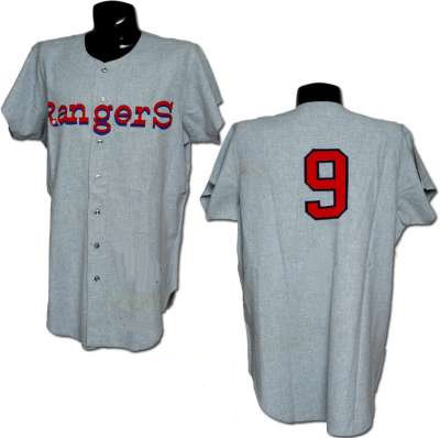 [January 7th] -- When guys my age curse at images of the Texas Rangers wearing those 1972 uniforms, this isn't the one we usually curse at. When we think of those garl darn razzin frazzin '72 Rangers, we think of the uniform shown below.
What's the difference?
Well, for one, the uniform at the left was never worn during the regular season.
In fact, they really weren't even Rangers' uniforms.
Today, it takes months for a baseball team's new uniform to be approved and constructed. The approval for the Senators' move to Texas occurred in September, giving Wilson Sporting Goods less than four months to have them ready for shipment to the team's spring training complex at Pompano Beach.
Realizing that th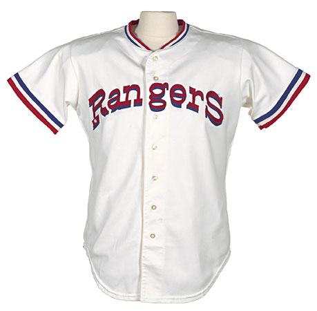 ey might not get the
 m done in time, they took a page out of the Milwaukee Brewers playbook and "got creative."
Ever wonder why there aren't very many of the 1971 Senators' jersey's available on the open market? Because they were shipped back to Wilson's manufacturing plant. A team of seamstresses removed the Senators script and replaced it with the initial version of the new Rangers design. If you look closely, the piping around the numbers on the back of the jersey is darker than the piping that surrounds the Rangers' lettering. That's because Bob Short, even after the move, was still cheap. He told Wilson to use the Senators' old numbers with the Rangers' new letters.
If you look at the "Rangers" logo, you'll see how different the first and second generations are. The Initial design was straight across the jersey front while the final version was arched and featured letters that were both taller and thinner.
Like I m entioned, the Brewers were forced to do the same thing with their uniforms. Afraid their fancy uniforms wouldn't be ready for their first spring training, they had simple, off-the-shelf uniforms created with nothing but a number on the back and block lettering along the front.
Their opening day uniforms, however, were ever ything that those spring uni's weren't. They featured naval "hacks" on the sleeves as well as a distinctive naval insignia above the "Pilots" lettering. Their uniform was like nothing we'd ever seen (Gene Brabender is wearing the home uniform). The road jersey was the first of the powder blue genre, featuring "Seattle" in all lower case lettering. And yes, the player in the road uniform is Jim Bouton, and yes, that's the old scoreboard in RFK Stadium!
Off course, the team lasted just one season. Things were so dicey that when t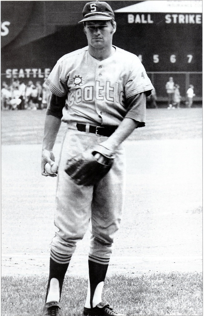 he team truck went north with all of the team equipment, the driver was told to drive to Salt Lake City and call in. By the time the call was made, the shift to Milwaukee was approved, and the driver drove east instead of west.
The team had literally just a couple of days to create a new team to play in a stadium that hadn't seen baseball on a regular basis in almost 15 years. The first problem: Where could they come up with uniforms by opening day?
The Brewer management gathered seamstresses who removed the lettering from the uniforms. New, simple block letters were purchased and sewn onto the old jerseys. If you looked closely, you could still see the holes in the material where the old stitches were. They now had home uniforms. What about those powder blue togs?
Always trying to save money, Bud Selig came up with a great idea. He would use some of the letters from the "Seattle" on the road uniform: the two "e's" and the "s" would work. The team bought letters for the B-R-W-R part of the lettering, and used the "e's" and "s
 " from Seattle. But no one noticed that the Seattle uniform was unique in 1969: they used lower case lettering. So when the Brewers went on their first road trip, they sported uniforms with both upper case and lower case lettering across the chest. They also left on the exaggerated nautical striping, or hacks, on the sleeves. What did these stripes have to do with Milwaukee? Nothing. They just didn't have the time to remove them.
The Brewers wore a new home uniform in 1972 (see below) that did away with Seattle's nautical design. Strangely, they wore the same road uniform for another year before changing its design in 1973.
So there you have it. Ju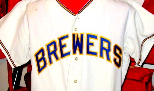 st as Mariners' fans get angry when they see those pseudo-Brewers uniforms, I am aghast whenever I see how those beautiful Senators' jersey's were defiled by Bob Short and his Texas minions. To some perhaps, a uniform is just another form of work clothes, but to me, a uniform represents the city, the team and a lifetime of memories. By using our uniform in Texas - no matter short the period of time - Bob Short took one last slap at the Senators' faithful.
Eat dog turds, Bob Short.
During my teen years, there was this insurance salesmen named Edsall Martz that had a baseball team. He was a converted Christian, and that was the name of his team-The Christians. He had baseball practice every single day of the year, even Xmas and Snow Days--no excuses. He always drove around in this beat up station wagon.
At one time, he was an Orioles Scout. When we played against his teams during summer leagues of 76 through 78, his teams wore the old wool home jerseys of the Baltimore Orioles. The Non Script ones with O-R-I-O-L-E-S written plainly across the jersey front in black.
The jerseys did not have names, but were tagged on the inside with player names, and some included Brooks and Frank Robinson, Boog Powell, as well as, Jim Palmer.
Have never forgotten that. And, I bet you no one cared, even in 1978, to even think about saving them as a collectible. Just wasn't the way people thought.

<< Home
![]()