CURLY'S, BLOCKS & SUPERMODELS
 [January 11th] -- Every time I re-read Nats 320's wonderful Stan Kasten interview, another fascinating "tidbit" emerges.
This time, I was in the middle of it (well, not in the middle of it exactly, but at least my name was mentioned):
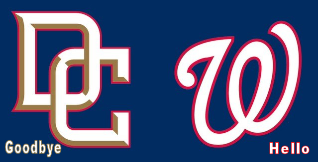
Screech asked Stan, "There was a post on The Beltway Boys Blog (our Idaho Based Nats Fan) that the Nationals were changing their Batting Practice Jersey with Curly "W" Logo for 2007? Are we losing the "DC" Logo?"
Kasten's reply: "Between the two, we are going to emphasize Curly "W" more and more. I am enamored with the Curly "W". I think its recognizable as a logo. Not what it stands for, just as a LOGO, it's a cool design. We are really starting to emphasize the Curly "W". Teams need a secondary Logo, that's what we have (DC Logo and it will stay).
I'm having a real difficult time with this one. As a Nationals' fan whose relationship with baseball in Washington predates the "Curly W," I have a close affinity to that logo. I doubt there was a single page of my junior high and high school class notes that didn't have at leat one "Curly W" doodled somewhere along the margins. Heck, I left People's Drug and moved to Denver to work for Walgreen's so that I could wear the vest and nametag that had that same "Curly W" (okay, there may have been other reasons for the move, but the 'W' was certainly a bonus).
As a kid, I liked the idea of an interlocking logo for the Senators hat, similar to what the Padres or Giants wore at the time. I thought an interlocking "D.C." would look really cool, perhaps on a sleeve patch or on the team's jackets. I was understandably excited, then, when the Nationals introduced their first uniforms that included both the "Curly W" and the interlocking "D.C." And even though I am an old-time "Curly W" guy, I've got to tell you that the sharpest uniform the Nationals wore last year was the red jersey with the "D.C." on the cap.
Frankly, I was hoping that the team would begin to use the "D.C." design more often in the coming years, not just on the uniform, but also as the team's "official" logo (like the circular Red Sox logo with the dangling sox inside). Perhaps the team might have left the "Curly W" on the home cap and used the "D.C." on the blue road version. Maybe the road uniform could have had the "D.C." logo on a sleeveless jersey along with blue undersleeves.
Sigh. Not to be, I guess. Kasten made if very clear that the interlocking "D.C." is strickly alternate s tuff - and that the "Curly W" (which I dearly love) is here to stay.
It's kind of like your wife telling you that you can "kiss" (euphemism alert!) one supermodel but only one, and then she gives you Miss U.S.A. and Miss Universe to choose from. I mean, I'd be an old man before I could make up my mind. Oh wait, I AM an old man. Well, they'd be old women then.
C'mon guys. "Curly W" at home and "D.C." on the road. Please?
I think I'd choose Miss Denmark too, not as fake looking.

 : 3:48 PM
 But maybe that's just because after the past 7years, I could never ever ever wear a W on my head.
: 9:26 AM << Home
![]()