SCOTT LITTLE AND HOW I'D LIKE THE NATIONALS TO DRESS
[December 14th] -- Doesn't this guy look like a GSA accountant dressed up f
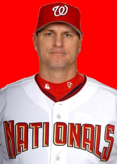
 or a seniors fantasy [December 14th] -- [December 14th] --Doesn't this guy look like a GSA accountant dressed up for a seniors fanstasy camp? In reality, he's Scott Little, the new manager for the Harrisburg Senators. He's been a minor league manager for more than a decade in the Pittsburg Pirates and Los Angeles Dodgers' minor league systems.
 Doesn't this guy look like a GSA accountant dressed up for a seniors fantasy [December 14th] -- [December 14th] --Doesn't this guy look like a GSA accountant dressed up for a seniors fanstasy camp? In reality, he's Scott Little, the new manager for the Harrisburg Senators. He's been a minor league manager for more than a decade in the Pittsburg Pirates and Los Angeles Dodgers' minor league systems.
Which of these uniform variants do you prefer? I photo-shopped the second image -- I took out the gold '3-D' shading which makes the letters seem larger and gives them a bolder look. I've always liked the Nationals' uniforms, but not the tri-color lettering.
What say you?
Scroll down to the previous post for all you want to know about the Jose Vidro trade. It's just that -- inbetween semesters anyway -- I've got nothing else better to do than photo shop baseball uniforms.
What say you?
Scroll down to the previous post for all you want to know about the Jose Vidro trade. It's just that -- inbetween semesters anyway -- I've got nothing else better to do than photo shop baseball uniforms.
Another Seattle Viewpoint: An interesting view of the Vidro trade eminating from Seattle:
Abandon Ship! Mariner Front Office Makes Awful, Awful Trade
"Three years ago, we all hoped for aging middle infielder Omar Vizquel to fail a physical so the M's wouldn't complete an agreed-upon deal for him. And our pleas were heard.
Well, M's fans, break out your prayers to the patron saint of aged middle infielders failing physicals again, because we need another favor from him. Pending a physical, the M's are going to deal two good young prospects, Chris Snelling and Emiliano Fruto, for the Nationals' Jose Vidro, a once-power hitting middle infielder who has suddenly hit for a lot less power since 2003 or so if you catch our meaning."
I don't believe for a second that Jose Vidro was ever under the influence of steroids, but the only chance Mariners' fans have is to pray to the "physical gods" in hopes tha t Vidro's knee isn't as healthy as the Nationals' suggest.
Twins? I was amazed at the physical similarities between current National Chris Booker and Emiliano Fruto, acquired in the Jose Vidro trade. If Fruto pitches as well as Booked did last year for the Nats, the team will be very happy with their bullpen twins.
t Vidro's knee isn't as healthy as the Nationals' suggest.Twins? I was amazed at the physical similarities between current National Chris Booker and Emiliano Fruto, acquired in the Jose Vidro trade. If Fruto pitches as well as Booked did last year for the Nats, the team will be very happy with their bullpen twins.
# posted by Farid Rushdi @ 8:21 AM 
Comments:
<< Home
I like the all red letters if they weren't stylized (you know, bigger at the ends than in the middle).
# posted by  : 8:57 AM
: 8:57 AM
I like the 3-d look but I would rather all the letters be the same size. I guess they had to do that to make "nationals" fit across the uniform -- that's a lot of letters.
# posted by : 10:49 AM
: 10:49 AM
I want the away uniform to drop the "blue" color scheme. Not that I don't like blue, I don't like the Nationals' blue.
Ever notice that most all the pictures of the Nats playing away make it look like they are wearing purple uni's.
Ever notice that most all the pictures of the Nats playing away make it look like they are wearing purple uni's.
# posted by : 12:20 PM
: 12:20 PM
Farid: I LOVE THE GOLD TRIM--it stands out like most other uniforms do not. In person at RFK, that UNI looks sharp. So does the Alternate Red DC with White Pants. The Away Greys just don't look too exciting. Then, how many teams have EXCITING away unis. Not many. Of course I love the San Diego Sand Color Away "SAN DIEGO" jerseys and pants. And, I know I am in the minority on that one.
Its the CURLY W cap that makes the jersey look strange at time. But, I love that Curly W Cap, too. and I know, for a fact, Management "LOVES" The Curly W
Despite all those comments, you can expect a change when the New Ballpark opens in 2008. Its the Opportunity for The Lerners to put their FINAL STAMP on the entire baseball operation, away from MLB Ownership. And, make a ton more money in merchandising.

Screech,
Though I am "anti colored jerseys," the Nats red jersey with the "DC" hat is one of the sharpest uniforms going today.
Though the team ressurected the "curly W" for us (those of us old enough to remember the Senators), I still think it a wise choice to go with the interlocking 'DC' as the standard hat and the 'W' as the alternate.
I'd still keep the blue away uniform if they change the hew. I don't like that purple either.
# posted by : 3:56 PM
: 3:56 PM
I have actually never noticed the "purple" that so many are talking about. Obviously, I have all the authentic jerseys, the away one is a very dark Grey--so dark it HIDES everything else on the uniform. That's why the "Washington" with blue/gold trim doesn't stand out, I could see a SCRIPT Washington Away Jersey with the Blue Curly W Cap. FYI, there is a serious rumor of a Blue Vest with DC INTERLOCKING LOGO on the left breast, number on the right lower, as an alternate, along with White Sleeves and a Blue DC Cap. That would BE SHARP!!
If it comes to fruition, this uni would most likely be a surprise announcement at an upcoming WINTER CARAVAN in January.
If it comes to fruition, this uni would most likely be a surprise announcement at an upcoming WINTER CARAVAN in January.
I guess I'm a contrarian here. I prefer the "3-D" lettering with the goldtrim both on the home uniforms and the away. I actually like the road uniforms with the grey and blue color scheme better than the home red and white.
I do agree that the "curly W" looks odd compared the print used on the shirt. I would prefer it if the team went to a script version of "Nationals" on the home uniform and of "Washington" on the road uniform, with a curly W incorporated into the spelling of the name on the shirt.
I do agree that the "curly W" looks odd compared the print used on the shirt. I would prefer it if the team went to a script version of "Nationals" on the home uniform and of "Washington" on the road uniform, with a curly W incorporated into the spelling of the name on the shirt.
# posted by : 4:25 PM
: 4:25 PM
I'm with SBF...there's nothing wrong with the Nats' home uniforms, and if anything it's the road uniforms that may need tweaking. I prefer the "Curly W" to the "DC" logo but I want to keep BOTH. Let the "DC" remain an alternate with the "W" as the main logo. I like it precisely because it was used before by the expansion Senators, and it honors Washington baseball history.
Speaking of honoring Washington baseball history, I'd love to see a game where the Nats wear the uniforms of the 1924 World Championship team. Maybe against the Mets or Giants who could wear the road uniforms of the team we beat in 1924 and lost to in 1933. But I'd only want them to wear that "throwback" for a special day. That team---great as it was---had to have one of the most boring uniforms of all time.
Speaking of honoring Washington baseball history, I'd love to see a game where the Nats wear the uniforms of the 1924 World Championship team. Maybe against the Mets or Giants who could wear the road uniforms of the team we beat in 1924 and lost to in 1933. But I'd only want them to wear that "throwback" for a special day. That team---great as it was---had to have one of the most boring uniforms of all time.
# posted by : 6:09 PM
: 6:09 PM
"IT HONORS WASHINGTON BASEBALL HISTORY" I couldn't have said it better than Eddie. Perfect that Curly W.
Post a Comment
<< Home
![]()