MORE ABOUT UNIFORMS
 [December 15th] -- I really think I'm a smart blogger, but I can't believe how wrong I am about my columns sometimes. I wrote a wonderful story a couple of days ago -- it was deep, factual and provocative. Not a single soul left a comment. Yesterday, I threw together one of those "oh by the way" stories about uniforms that consisted of a couple of paragraphs and nine people left comments.
Go figure. Anyway, I got some more to say about uniforms, my favorite baseball subject.
One of the comments left yesterday dealt with the Nationals' road uniform. That reader said (and I agree 100%) that pictures of the Nats' blue based road uniform more often than not reproduces as purple. Take a look at the above image of Nick Johnson. The larger areas of blue, particularly the numbers on the back of the uniform, usually look fairly blue. But the smaller areas, the piping on the shoulders, the players name, look purple. I have more than 200 pictures of Nationals in their road uniforms in my baseball folder, and nearly 80% of them have a decidedly purple hue to them.
Compare Nick's picture to Tomo Ohka wearing a Brewers uniform. Their blue is a bit brighter, and reproduces much better than the Nats' blue.
I love having unique home and road uniforms, I just wish the Nats could shift the blue a little bit so pictures of our beloved players accurately portray the uniform as designed.
Screech's Best Friend from Nats 320 reports a rumor he's heard: "FYI, there is a serious rumor of a Blue Vest with DC INTERLOCKING LOGO on the left breast, number on the right lower, as an alternate, along with White Sleeves and a Blue DC Cap. That would BE SHARP!!" I think that would be an outstanding alternate, and would love to see the boys wearing something like that.
Bob Short Cheap Shot: We all know how cheap Bob Short was, especially that last year in D.C. When I went to RFK, I usually sat in the lower deck underneath the upper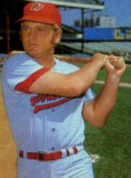 deck over-hang. My brother was feeling especially rich one day, and bought tickets right behind the Senators' dugout. It was great. I was close enough to see the stitching in the uniform. It was the same one they had worn since '69. I did notice that the "curly W" looked a little different. After several players ran in and out of the dugout, I realized that the "W" wasn't embroidered on the cap, but was a patch that was sewn on the cap's front panel. Even the "W" looked different from the one used since 1964.
I started to holler at each player as they went in and out of the dugout during warmups. "Hey, what's with the cap?" I would say. Finally, after twenty or thirty tries, a player glanced up at me (I can't remember who) and said, "Short's a cheapskate!" Later that summer, I read an article in one of the local papers that said that Short, trying to save money, indeed had that "W" made into a patch that was then sewn on the cap. The article reported that the savings were "negligible," but that the many cutbacks added up to a fairly substantial savings for the team. This picture of Jeff Burroughs isn't great, but it's the only one I can find where the "W" on the cap is noticeably different from past years. If you look really close, you can make out the seam around the "W." Also, the middle circle of the "W" is as tall as the rest of the letter. On all the other caps since 1968, that middle circle is much lower than the ends. Important? Nah. I just enjoy taking a swipe at Bob Short every chance I can get.
Felipe Lopez? I'll second that motion: Bill Ladson is reporting that shortstop Felipe Lopez is happy to move to second base next season, allowing Cristian Guzman to regain his starting job at short. "I have no problem playing second base. I played there before. I just have to go to Spring Training and work at it. I haven't played there in a long time. It should not be hard."
Lopez' problems at short stem mainly from his throws to first base. He made 28 errors in 2006, and will likely halve that number playing at second. Remember how all of us pish-poshed Guzman's defense in 2005? He committed only 15 errors all season. In the three previous years, he averaged just 12 errors. An infield of Johnson, Lopez, Guzman and Zimmerman should be one of the better defensive infields in the National League.
A white vest with red sleeves and the interlocking 'DC' and number on the front would look nice as well.
 : 9:21 AM : 2:28 PM
 << Home
![]()